I haven’t done an illo or a portrait in quite some time and this idea has been stewing in my head for a while. Perhaps I’m late to the party on it but methinks that somehow it’s going to get re-started come October, maybe even well before then. Mealsothinks that somehow this will not be used for his campaign. Maybe because of the colour? I can’t quite put my finger on why not…
Malika‘s work is just…wow. While I love to see fine detail in certain works, the amazing thing about Malika’s work is how pared down it is without losing a sense of richness and depth. And it’s vivid both colourfully and content-wise. Her Kama Sutra project is all at once hilarious, witty, naughty, and fun. This is a way of working I had thought about trying to accomplish on my own after spending so much time in Illustrator lately and prior to having seen Malika’s stuff. Now that I have, well, what’s the point when she does it so well already? Still, it might be fun to try and play with.
here’s to one of the greatest risk takers of our age. even if you don’t like his company or his products, i’d be willing to bet that his and his team’s work influenced the product you chose as an alternative.
national geographic says that these are possibly the ugliest animals on earth. poor guys. they need love too, right? you might remember one such fish from a certain disney movie about a certain clownfish (link to appear when they’re drawn…if i remember). the largest of these fish (of which there are hundreds of different of types apparently) are over three feet long. that’s over a hundred pounds of ugly-fish! not my words, national geographic’s i swear. what’s crazier is that their mouths are flexible enough for them to be able to eat prey that is double their size. so if you are one such fish, don’t call them ugly and don’t look at their fishing rods dorsal protrusions. anglerish in moleskine.
just a quick little ditty for illustration friday this week. the theme is soaked. i thought i’d take a different perspective on the meaning.
i played around with all manner of colouring for this after i brought it into photoshop and while i found certain results interesting, i opted for the most minimal. here were a few of those experiments.
decent contrast here but the details of the original drawing kind of got lost.
another alternative:
i tried to let the background provide some contrast and restore some of the detail.
overall, i actually liked the process that went into achieving the two draft versions but i didn’t like that i lost the detail that i feel needs to be seen. finding that process was a happy accident, just not one that jives with this portrait i think. i guess the lesson for me was that i can’t always be calling an audible on the final output. i should work on planning more…maybe. matt berninger of the national.
these guys live as long as humans. i didn’t know that, like many of the animals i have and will be drawing, they’re endangered. that’s part of the point of this project of mine. i remembered from school that you can tell crocodiles from (american) alligators by their longer but thinner snouts. also, they don’t like the cold as much as alligators. they seem to eat just about anything, including humans but that (apparently) is rare. crocodylus acutus in moleskine
you can now get your “a blaffair to rememblack” and the more recent portrait of leslie nielsen through society 6. tell all your friends! thanks in advance!
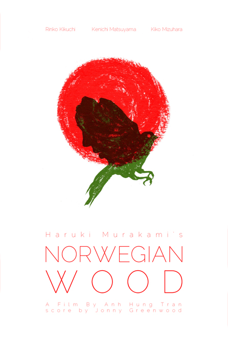
my entry for don’t panic‘s poster design competition for the film adaptation haruki murakami’s norwegian wood. jonny greenwood did the score! i’ll post more about the design after the competition closes at the end of the week. enjoy.
portrait of robin pecknold. before i learnt that a certain band’s new album will be released this saturday, fleet foxes‘s new album was probably the one i was anticipating most. i’m currently rotating between in rainbows, high violet and fleet foxes. two out of three ain’t bad, right? maybe if i work on an illustration of the national, they’ll announce / release a new album? at the rate albums are released these days (and i’m not complaining), probably not. but here’s to hoping? i might post the process later but there wasn’t much behind it though a wee bit of “undocumented” thought went into the colouring.


