
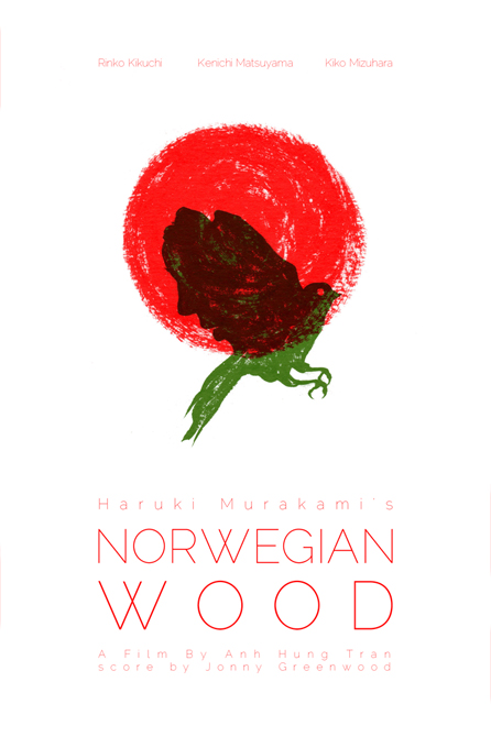
my entry for don’t panic‘s poster design competition for the film adaptation haruki murakami’s norwegian wood. jonny greenwood did the score! i’ll post more about the design after the competition closes at the end of the week. enjoy.

for the third iteration, i wanted to use blocky lettering to imply the issue at hand. after playing around, the sketches i ended up with reminded me of the first things first manifesto. i was really taken with the lettering used in the original version so i used a similar version here, at the risk of contradicting the manifesto’s intent.
part of what i love about the lettering is the contrast not only of the widths of the stems to the negative space between them but to the space between letters as well. what really makes the letters shine for me is the angled terminal at the top of each “t.” i really wanted to try and work that into my design but it just didn’t make sense to.
the curious thing about the lettering to me is how the space between the letters really influences the perception of the height to width ratio. when spaced so closely together, as in the original manifesto, the letters seem quite tall. as you might see above, the lone “i” above seems quite comfortable on its own but its length seems to be emphasised when placed with the rest of the letters in “issues.” anyway, that’s an aside.
the group of designers, photographers and students essentially pledged to devote their skills to higher purposes, specifically over hawking wares for the sake of consumerism and nothing more. this poster might not suggest the opposite since there really is no great purpose to the poster. as with the others, this one’s just supposed to cause a smirk maybe and be ephemeral. and if people like it enough, sure i’ll make prints. but i recently worked on something where i was told, why bother put the all this thought and effort into something if no one’s going to get it? well, like the manifesto kind of suggests, it’s about doing a good job but i think that a good job should be done on everything you do.
if i put effort in and something isn’t communicated well, then it wasn’t as good a job obviously. but the challenge is to make that communication work, even in something as silly as this. the real irony is that you probably got none of this just from looking at the poster, unless of course you’re familiar with the original 1963 manifesto.
i chose yellow specifically because i don’t use this colour enough. in trying to keep things simple, it’s tough to use yellow on white but why not put it on black? sometimes yellow is perceived as cowardly but i think it works in an ironical sense here. i don’t think it’s cowardly to admit that you have issues. on the flip side, yellow is also perceived as bright, happy, and cheerful (especially in contrast to the usually negative black). again, nothing wrong with admitting that one has issues. accept it and move on, right? finally, i chose to imply the space issue but simply leaving space there. you can either see the space for what it is was intended or you can fill it in an personalise the poster by admitting to your own issue.

the border is there just to show the overall grid and layout. i decided to dead centre this to create the underlying space issue (at least one of them). i thought about absolutely evenly spacing the letters over the entire layout but i like the word search implication. i can’t help but try to string together different words by starting somewhere in any which direction. wasn’t that some alternate game to traditional word searches? i can’t quite remember. i have a terrible need to keep working on this to make it more interesting but i just want these to be very quick, ephemeral, and playful without too much going on.

a little while ago i was asked to design a poster for a 10 year high school reunion. the basic need was to convey the message of fundraising through the fees for the event and use the school colours and/or emblem. i wanted to convey a sense of identity despite it being difficult to visually depict that with a few hundred people who belong to one graduating class of a rather old school. of course, the students collectively comprise the identity of any class and this was the basis for my design.
i’ve become fond of the idea of purely using text in illustration so i thought i would give that a go. my immediate thought was to use a classic fingerprint image integrated with a paw logo the school used at the time. instead of a fingerprints, the image would have pawprints. instead of typical lines for the prints, i would use peoples’ names arranged along the paths where the fingerprint lines would go. to push it a bit further, the fingerprint paths would spell out the school’s intials and the year of the class but hidden among filler lines (i guess you could call them)
the concepted paw came out as follows:

now, the organiser thought all this effort might be lost easily considering that facebook would be the primary group event site and the image would be rather small. i thought about ways to make these ideas more obvious which led to some slight modifications. hopefully you see what i meant with the hiding of the initials and year.


the group organising the event ended up liking the original text based idea so i just needed to add the title and slogan. i thought about a couple of ways to do this too.

claw marks!
i preferred the claw mark idea but the consensus was to go with this, voila: