

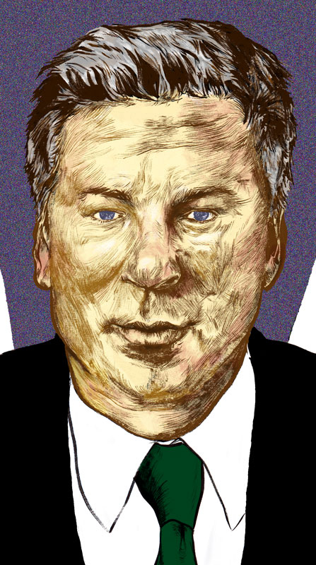
here we have jack donaghy and his mentor don geiss, reincarnated into a peacock as one episode suggested. the intent behind this illo was to try and preserve a little but of humour while revealing some traits of the inventor of the tri-vection-oven.
essentially, this is about the relationship between donaghy and his mentor. also, i just wanted this to remind viewers of the rather hilarious storyline involving them and gob devon banks and their battle to succeed geiss. argus was don geiss’s pet peacock whom donaghy inherited after geiss’s passing. donaghy ended up believing that the soul of don geiss resided in the peacock’s body and in a strangely profound (for 30 rock…right??) way reinforces the idea of donaghy’s devotion to nbc. so instead of the peacock’s usual tail (which i thought was too obvious), a certain television network’s logo is suggested. but this isn’t just to reference nbc – it’s also to try and show that jack is using the logo to compensate for the peacock not wanting to dazzle us. donaghy’s a fixer so this is his fix to try and dazzle and sell you on something he wants you to do.
i don’t think i will post much on the process this time but i did draw and ink this on a much larger scale than usual. scanning that in proved to be a bit of a palaver but it turned out ok.
here are some more detailed crops:


i do love me some 30 rock. if you’ve been paying attention, i finished a movie poster for a blaffair to rememblack a little while back. 30 rock is one of those shows where the one-liners come out of nowhere and then sometimes they just disappear all together to make room for more. for my next project, i wanted to try and incorporate some of my favourite lines and moments. rather than try and posterise this one, i just wanted to have fun with an illustration.
the underlying inspiration is one tracy jordan line: “i spent nine months in japan filming samurai i am awry.” when i first heard the line i thought he said, “samurai i-amurai” and that he was just making up a ridiculous word. in doing research for rememblack, i actually saw the written text and had a good chuckle, long after the fact.
genius.
one of my favourite scenes from the entire series comes from the first episode where tracy is seen running down a highway in tightey-whiteys and tube socks, wielding a toy light sabre, and screaming, “i am a jedi! i am a jedi!!”
again, genius.
so that scene also needed to be alluded to in this illustration. in continuing with this story that i made up to drive the illustration, i took the liberty of setting it in japan and assuming that he didn’t actually finish filming the samurai movie. his character just doesn’t really finish anything. but in his defense, in this alternate 30 rock dimension (30-D?? lame), he finds a real lightsabre. would you keep on filming a movie if you found a light sabre? i rest my case.
i like that 30 rock embraces the cliches and makes fun of them so i wanted tracy running off in a meadow or something toward a sunset in a very cliche way. while doing so he would just shed his samurai armour and sword along his path. i realised early on that if he were running off toward the horizon, there would be little to tell the viewer that it’s tracy jordan outside of the title and his outfit from the first episode. but this is a drawing for 30 rock fans who i hope will understand.
here is the initial sketch:

originally i was going to make this a tad more destructive. tracy would’ve just been trying (and succeeding!) to cut up everything in his path. so you can see singed tree stumps and sliced trees and grass if you look closely. i decided against this though as i wasn’t sure if there would be just too many elements drawing the viewer’s attention in so many directions. in more experienced hands, this probably could’ve been done effectively but i’m not going to claim that my hands are anywhere close to that.
another problem was that there really wasn’t any imagery to suggest the japanese landscape. cherry trees came to mind but i thought the more obvious choice would’ve been a pagoda or temple silhouette or something. i just very quickly (and crappily) drew up where i wanted the trees to be and the temple as well.

so far so good. i got to drawing more detailed trees and i also decided to leave out the temple / pagoda. just wasn’t feeling it. i did a cleaning of my studio recently and i can’t find the final pencil sketch of the trees so on to the inking. i’m not sure if i’ll make a habit of this but i thought i’d try inking in steps and scanning the results to try and save time if mistakes were made. here’s the rough progression:

the original is 11 x 18″ and was scanned in a couple of times and stitched together in photoshop. here is the full piece and some detailed shots.


i have to admit i didn’t really think too far ahead about the colour palette but i decided to stick to what i guess you’d call realistic colours. one thing was for sure, tracy jordan would want to rock a lightsabre coloured like the only “bad ass muthafucka” jedi – mace windu. also, tracy’s underwear had to be white.
the trees, field, hills, and sky were pretty much decided on in this kind of typical field setting. for the sky, i did want to have a nice blue-purple-red transition. i wasn’t overly sure about the colour of his discarded armour though. he seems to wear a lot of red so i thought about doing a red and yellow scheme but i kept being reminded of the flash or ironman. i pondered it while moving on to colouring tracy’s socks and shoes.
as soon as i got to his shoes, i remembered the episode where tracy not only dons golden shoes, but is too proud to be helped to lug around the weight. another great scene and that answered the question for his armour – gold!
the colour process overall took longer than i thought. this post is getting pretty long so i won’t really detail it here but i may update this later on. i ended up with many, many layers and a 500+ mb file – take that yuko shimizu!!
here is the final piece. i hope you enjoy it, i had a lot of fun doing this. i’m not sure if i will do another 30 rock piece but once the season starts i may just change my mind on that.


UPDATE: please inquire if you’re intereseted in a print. thanks!